
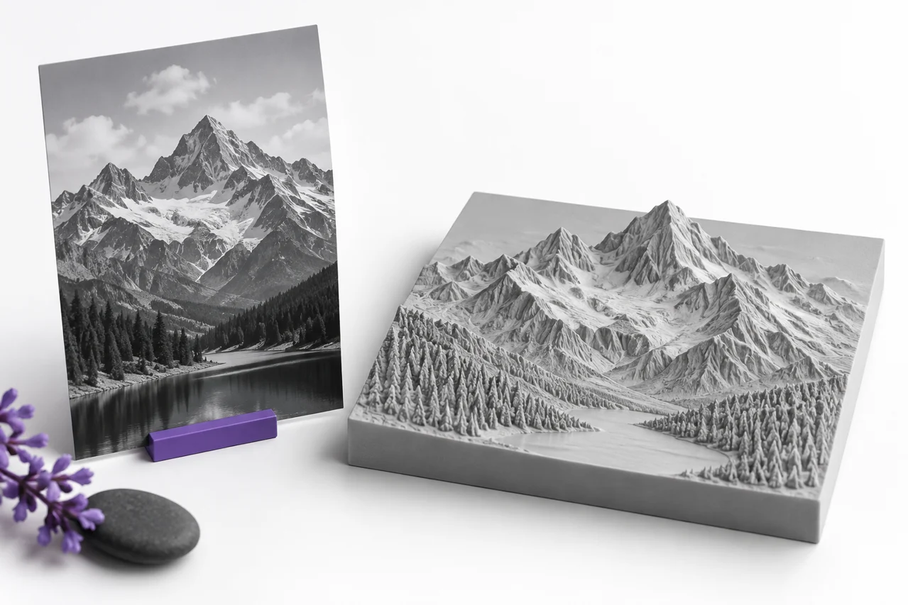
AI-generated editorial illustration, not a screenshot of a conversion result.
A JPG-to-STL conversion can turn a photograph into a relief or turn high-contrast artwork into a raised silhouette. It does not discover the hidden sides of the photographed object. The result is based on the image's two-dimensional pixels and on the rule used to translate those pixels into geometry. Choosing that rule before uploading is the most important preparation step.
The JPG-to-STL converter offers outline extrusion and heightmap relief. An outline gives selected foreground pixels a consistent thickness. A relief varies surface height according to brightness above a base. Both can be useful, but a photograph, a logo and a technical heightmap contain different kinds of information. This guide helps you choose an appropriate source and avoid turning image artifacts into unwanted features.
Choose outline or relief according to the source
Use outline extrusion when the main information is the boundary of a shape. A simple black icon on white, bold lettering or a clean silhouette is a good candidate. The foreground becomes a raised volume with uniform depth. Color variations within that foreground are not intended to create different elevations in this mode.
Use relief when variations in brightness should become variations in height. This works naturally with an intentionally prepared grayscale heightmap. A photograph can also produce an artistic relief, but photographic brightness is influenced by lighting, reflections and shadows. A dark shadow may become a raised region even when the photographed surface is physically flat.
Do not choose relief simply because the source is a photograph. Consider the desired result. If you want only the outline of a pet or a building, isolate a silhouette first. If you want a portrait-like surface, prepare tonal relationships deliberately and accept that the result is an interpretation of brightness rather than a measured three-dimensional scan.
Understand what JPEG compression contributes
JPEG compression can introduce small halos, block patterns and ringing near sharp boundaries. On screen these may be subtle. During conversion, they can become tiny islands, rough edges or surface ripples. Saving the same image repeatedly at a low quality setting can make the problem more visible, particularly around text and high-contrast line work.
Work from the best available original. If a logo exists as SVG or transparent PNG, use that source instead of a JPEG screenshot. The SVG tool accepts supported self-contained paths and shapes, while PNG to STL can follow genuine transparency. Each avoids some problems introduced by a flattened, compressed background.
Increasing the pixel dimensions of a damaged JPEG does not restore lost edge information. Upscaling can make an image larger without making its boundary more trustworthy. Clean obvious artifacts in an image editor and evaluate the actual silhouette or tonal surface you want to preserve. A smaller clean source can produce a better model than a large noisy one.
Remove backgrounds deliberately
JPEG has no alpha transparency. A white canvas is still image content, not empty space. For a dark logo on white, choose the converter's light-background removal mode and inspect the threshold. If you leave the complete rectangle selected, the canvas becomes part of the output by design, which may be appropriate for a plaque but not for freestanding lettering.
A threshold separates pixels according to brightness. It cannot reliably distinguish a white highlight inside the subject from a white background outside it. When those areas have similar values, simple threshold removal can cut holes through the subject or retain unwanted parts of the background. More complex scenes usually need preparation before conversion.
For precise isolation, create a transparent PNG in an image editor and use the transparent-outline workflow. Keep intentional holes transparent and remove stray pixels around the boundary. This gives the geometry process an explicit foreground mask rather than asking it to infer object identity from color alone.
Prepare brightness as a height signal
In heightmap mode, inspect the grayscale version of your image. Colors that look distinct can have similar luminance and therefore produce similar heights. Conversely, a sharp lighting change can become a steep geometric step. Think of the image as a height instruction rather than only as a picture, and adjust it to match the surface you want.
The default workflow raises darker regions. Use inversion when the opposite relationship is appropriate. Before converting a detailed image, try a simple gradient or a crop containing a few known tones. The preview will show whether dark and light areas are moving in the intended direction. This short check avoids interpreting a complex result with the height relationship reversed.
Control contrast carefully. Strong contrast creates larger height differences, but clipping everything to black and white removes intermediate levels. Moderate tonal adjustments can reveal features while preserving transitions. If a bright reflection or deep cast shadow has no useful geometric meaning, edit it rather than relying on the converter to recognize and ignore it.
Set physical width, depth and backing
Width sets the physical scale of the generated artwork. The height follows the detected foreground's proportions, so a tall narrow image can create a correspondingly tall model. Check the resulting dimensions, especially after background removal changes the occupied area. Cropping the source to the intended artwork also makes that relationship easier to understand.
Depth controls the raised portion. More depth is not automatically more detail. Excessive relief height can turn small tonal variations into steep ridges that are difficult to print or visually distracting. Start with a restrained depth, inspect the surface from the side and increase it only when the design benefits from stronger height differences.
A relief backing supports the varying surface above it. It should be appropriate to the intended handling and printing process. A thin backing can be useful for a lightweight decorative piece, but it may be too flexible for another purpose. Our relief settings guide explains the relationship between base thickness, raised depth and surface detail.
Use sampling quality for the details that matter
The high-quality default samples up to 512 points along the image's longest edge. This is a geometric sampling limit, not a promise that every source pixel becomes an independent printable feature. A very large photograph is reduced to a manageable working grid. The physical size of the output determines what that grid spacing means in millimeters.
Use a lower quality level for a quick experiment when you are still choosing background and height behavior. Return to the high setting once those choices are settled. Increasing sampling before fixing an incorrect threshold mainly produces a more detailed version of the same wrong silhouette. Solve the interpretation first, then refine its representation.
Smoothing can reduce abrupt height changes in a relief. It may help noisy photographs, but it can soften fine lettering and narrow ridges. Compare the result with and without smoothing in the regions that matter. Outline edges and relief heights serve different purposes, so do not assume one setting improves both in the same way.
Inspect the geometry rather than only the front view
Rotate the model to inspect its sides and backing. A relief that resembles the photograph from directly above can look very different at a shallow angle. Check whether height transitions are coherent, whether the base is present and whether isolated bright or dark specks created unexpected geometry. The neutral gray preview helps separate shape from the original image colors.
Look for disconnected islands in outline mode. Dots, accents and isolated logo details can become separate pieces. If you need a single handled object, connect them in the source artwork or add a deliberate backing through a suitable design workflow. Their separate appearance is not automatically an error; it depends on what you intend to manufacture.
Standard STL stores the mesh, not the original photograph's colors. A gray preview is therefore consistent with the geometry-focused output. If you need color textures or an image printed onto a surface, that is a different workflow. Changing the STL preview material cannot add color information to the standard STL file.
Verify the download in the next application
Download the STL and open it in your slicer or mesh editor. Confirm dimensions and inspect sliced layers. Fine lines that look visible in the geometry can still disappear under the chosen nozzle and extrusion settings. For a large decorative piece, print a small representative section at the final scale before committing to the entire object.
Keep the prepared image and note the conversion settings. If you later need a thicker version or a different width, returning to the source is usually easier than editing a dense relief mesh. Save separate revisions for changes to the image and changes to the converter settings so that you can identify which improvement affected the result.
A dependable JPG-to-STL workflow starts with a clear intent: silhouette or tonal relief. Prepare the background and grayscale signal, set sensible physical dimensions, inspect the preview from multiple angles and verify the exported mesh in its destination. The converter supplies the geometry rule; the quality of the source and the clarity of those choices determine whether the result is useful.
Compare one change at a time
When refining an image, keep width and depth fixed while testing a new threshold or tonal adjustment. Then compare the same region of each output. Changing several controls at once makes it harder to identify which change improved the shape. Once the foreground and height behavior are correct, adjust the physical dimensions for the final use.