
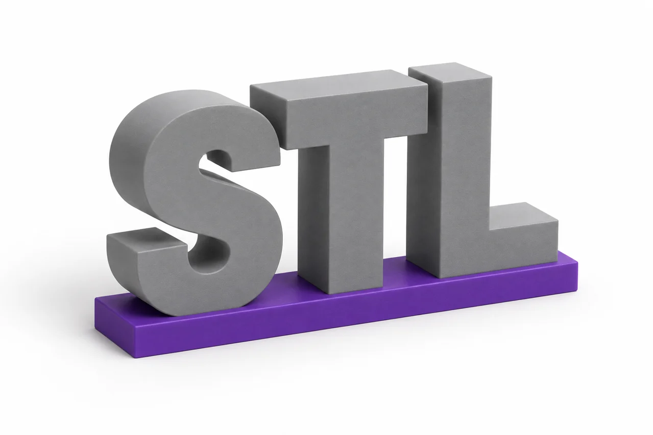
AI-generated editorial illustration, not a screenshot of a conversion result.
Text-to-STL preparation is a small design task, not merely a change of file extension. The shape of the letters, their spacing, their physical thickness and their connection to one another all affect the result. A word that reads clearly on a screen can become fragile or disconnected when turned into a small three-dimensional object.
A practical workflow is to create the lettering in a vector editor, convert the text to paths and export a self-contained SVG. Use the SVG-to-STL converter to extrude the prepared artwork. A transparent PNG is another option when the source is raster artwork. This guide explains how to choose lettering, connect isolated parts and verify a result that is useful beyond its front-view preview.
Choose the intended physical object first
Decide whether you want individual letters, a connected word, raised lettering on a plaque or recessed lettering in another part. These are different constructions. Individual letters can remain separate by design, while a freestanding connected word needs physical bridges between its parts. A plaque provides a backing that supports details that would otherwise be isolated.
Consider how the object will be handled or mounted. A wall sign, a key tag and a tabletop nameplate experience different loads and need different proportions. A thin decorative stroke may be acceptable on a supported plaque but unsuitable as the only connection between two freestanding letters. Plan the support structure before refining small typographic details.
Set a target width early. The same font can be practical at 200 mm and too delicate at 30 mm. Physical scale determines stroke width and hole size, so it should guide font choice and spacing. Do not wait until the final slicer import to discover that the desired overall size makes most of the lettering disappear.
Choose a font with printable features
Bold, simple lettering is often easier to prepare than very thin or highly decorative text. Examine the narrowest strokes rather than the average stroke weight. Serifs, flourishes and small interior counters can become the limiting features. A font that looks heavy overall may still contain a delicate connection that breaks during handling.
Script fonts can create naturally connected words, but their overlaps need inspection. Letters may appear to touch while remaining separate paths with only a tiny contact region. Some scripts also contain isolated dots or accents. Treat those as design features that need support, not as surprises to solve after the mesh is generated.
Check the font's license for your intended use, especially when distributing designs or selling products. Converting letters to geometry does not itself establish permission to use a font commercially. Keep a record of the source and applicable license along with the design project so that future reuse does not depend on memory.
Convert text to paths before SVG export
Live SVG text depends on a font being available and on how the receiving application renders it. Converting text to paths stores the letter outlines directly in the artwork. This makes the shape more portable and avoids font substitution. Keep an editable text copy in your design project before outlining, because changing wording becomes less convenient afterward.
The site's SVG workflow accepts supported self-contained paths and shapes rather than live text. Remove linked resources and unsupported styling constructs, and use explicit fills. The SVG preparation guide explains the supported artwork structure and why a visually correct SVG can still need cleanup before processing.
Reopen the exported SVG to confirm that the outlines remain correct. Look for missing letters, filled counters and unexpected clipping. A character such as O or B contains interior openings that must remain represented properly. A path operation that changes fill behavior can turn those openings into solid regions even before conversion to STL.
Plan dots, accents and disconnected letters
A transparent image or SVG can contain many separate foreground islands. In outline extrusion, those islands become separate pieces. This is a faithful interpretation of the source, but it may not match a user's expectation of one connected word. Inspect dots, accent marks, punctuation and gaps between letters deliberately.
To create one handled object, connect the islands in the artwork or use an intentional backing. A bridge should have useful physical width and overlap the connected regions clearly. A hairline touch is not a robust connection. Place bridges where they preserve readability and fit the design rather than adding arbitrary bars after the model is already dense.
If you want separate pieces for arranging on a surface, preserve the separation and plan how they will be positioned. A mounting template or backing layout can help maintain spacing. The important distinction is intentional structure: disconnected geometry is useful when designed for it and frustrating when discovered only after printing.
Use transparency correctly for raster lettering
A transparent PNG can also define letter outlines. The alpha channel identifies the foreground, so empty pixels do not need to become a rectangular base. Use the PNG-to-STL tool with transparency preserved, and inspect the source for stray visible pixels or a background that merely looks white.
A screenshot of text on a white page has a background even if the intended design does not. Simple background removal can work for high-contrast artwork, but antialiased edges and compression artifacts require care. For a clean logo or wordmark, a true transparent export is generally easier to reason about than repeatedly adjusting a threshold on a compressed screenshot.
Read the transparent PNG guide if the output includes an unwanted square or missing interior holes. Check both the foreground boundary and the interior counters. A visible checkerboard painted into an image is not transparency; it becomes image content unless removed.
Set width and extrusion depth together
In outline mode, the selected foreground receives uniform extrusion depth. Width sets the overall scale of the detected artwork, and the other in-plane dimension follows its proportions. Choose a depth that suits the intended handling and mounting method. A deeper extrusion can be sturdier, but it also changes appearance and print time.
Width changes the physical size of every narrow stroke and gap. If a word becomes unreadable at the target size, increasing only depth does not solve thin in-plane strokes. Adjust the font weight, simplify details or increase the overall size. The geometry needs enough width where the printer lays down material, not just enough height above the bed.
For lettering on a backing, consider the total thickness and the raised portion separately. A backing supports isolated characters and can provide space for mounting holes. If you add such a backing in a modeling application, create a deliberate union where one solid is intended and inspect the resulting interfaces.
Understand the sampling limit of image-based conversion
The conversion pipeline samples artwork on a grid, with the high default using up to 512 samples along the longest edge. Even an SVG passes through this sampled process in the current tool. It is not an exact preservation of every vector curve. Very small details can therefore be limited by sampling as well as by the eventual printer.
Prepare artwork with clean proportions at the intended output size. A long line of tiny text spreads the available samples over many letters, leaving fewer samples across each stroke. Shorter text, a larger physical layout or a different design can be more effective than adding intricate details that the workflow cannot represent usefully.
Inspect curved edges and narrow gaps in the preview. If the sample grid visibly limits a critical feature, use a CAD or vector-to-solid workflow capable of preserving analytic or higher-resolution boundaries. The appropriate tool depends on the required result; a browser outline converter is convenient, but it should not be mistaken for an unlimited precision lettering system.
Check the sliced lettering before printing
After downloading, open the STL in the viewer and your slicer. Confirm scale, overall thickness and the number of separate pieces. Then inspect layers around narrow strokes and small holes. A feature can exist in the mesh yet disappear when the slicer plans paths for the configured nozzle and extrusion width.
Review the first layer and any bridges between characters. Freestanding lettering often has a relatively small contact area, while a plaque offers a broader base. Choose orientation and process settings according to the actual geometry. Our slicing guide explains the separate printer-specific decisions that follow mesh creation.
For a large sign, print a short representative section at final scale before making the whole object. Include the thinnest stroke and a connected junction in that test. This provides more useful evidence than printing a uniformly scaled-down word, because scaling down changes the very feature dimensions you are trying to validate.
Keep the editable lettering source
Save the original text, the outlined vector version and the final STL separately. If the wording, font or width changes later, return to the editable source. A triangle mesh is a poor place to correct spelling or redesign kerning. Record the chosen physical dimensions and conversion settings so that related signs can be produced consistently.
A useful text-to-STL result comes from readable outlines, intentional connections and dimensions matched to the manufacturing process. Prepare the typography first, preserve holes and transparency, inspect the sampled geometry and verify the sliced layers. Those steps turn a visually attractive word into a clearly defined physical design.
TXT to STL: lettering is different from parsing a text file
A request to convert TXT to STL may mean plain lettering, a coordinate list or an ASCII mesh saved with an unusual extension. These are different inputs. This site does not interpret an arbitrary TXT document as a three-dimensional model.
For lettering, lay out the text in a suitable design application, convert fonts to paths for SVG or export a transparent PNG, then choose outline extrusion. Check detached dots, accents and counters so the printed result stays connected where needed. Preserve the editable text source.
Extrude supported SVG lettering · Use transparent PNG artwork